15 Ways to Fix Your Site Immediately
Within 5 seconds of landing on your website, can your visitors determine what your company does? Could users easily navigate to the blog if they need to? Is the layout of your pricing easy to understand? Do you have an extremely high bounce rate?
If you’re finding yourself answering ‘no’ to these questions, it might be time to take a hard look at the way you’ve been designing and optimizing your website.
A website can’t simply succeed by excelling in limited aspects (such as solely design or content). It needs to have a design that feeds into your website’s user experience, functionality, and appropriately complements your content.
Your website also needs to clearly communicate with your audience what you do, why you do it, and who you do it for.
1. Have a plan –

Don’t just start designing your website. To ensure that your website is effectively meeting the needs of your visitors you need to map out your buyer’s journey from the first time they visit your website to the moment they become a customer.
What pages are they going to view, what content are they going to read, and what offers are they going to convert on? Understanding this will help you design a site that helps
You want to design your website for the next step, not the final step. It’s all about answering the right questions in the right order. This might be where context comes into play. Take what you already know about your current customers (or even interview them) and research how they went from a visitor to a customer. Then, use this data to map out your strategy.
2. Remove the following from your website –

Pretty much every link which is irrelevant to your website falls in the category of bad backlinks – with the exception of editorial links from large publications.
That said, the chances of getting a low-quality backlink removed by asking the offending webmaster nicely are close to zero. It’s a step Google requires you to take before asking them to ignore the link, however, so you should at least attempt it
3. Add a Value Proposition –

The value proposition, or mission statement, tells the visitor what you do and why you do it.
Put your value proposition on your home page, in your headline if possible. Add it to your blog or about page. Let the visitors know exactly what they will be getting if they hire you, buy your product, subscribe to your newsletter or read your blog.
4. Include social share and follow buttons –

These links and buttons enable your website visitors and content viewers to easily share your content with their social media connections and networks. Adding these buttons to your content allows you to expand the reach of your content to new audiences and generate new visitors back to your website.
You should add social media sharing links/buttons to every piece of content you create, including landing pages, web pages, individual blog articles, email content, etc. The Tweet/Share Button, Facebook Like and Share Buttons, and LinkedIn Share Button (and more) that we’ll cover in this article all serve as social media sharing buttons.
5. Implement calls-to-action –

The call to action is a key element on a webpage, acting as a signpost that lets the user know what to do next. Without a clear CTA, the user may not know the next steps to take to purchase a product or sign up for a newsletter and is likely to leave the site without accomplishing their task.
A call to action makes it clear to potential customers which action to take next and helps remove friction in moving the user down the sales funnel. There can also be multiple calls to action on a page if there are multiple desired actions for the user to take.
For example, if a reader lands on a blog article and there is no clear call to action at the bottom of the post, it is likely that the reader will leave the site without completing any other tasks. However, if there is a CTA at the bottom of the post asking them to read more articles or to sign-up for an e-mail newsletter, that can encourage them to continue interacting with the site.
6. Use the right images –

Not every image is going to fit with the type of message you’re trying to show your audience.
Fortunately, you have a lot to choose from (even some that are for free). But still, cause caught many of us decide to plague our website with extremely stocky photos.
Just because a stock website has the image, doesn’t mean it looks genuine and will evoke trust in your company. Ideally, you want to use photos that portray images of the real people that work at your company and the office itself.
If real photographs aren’t an option, there are techniques you can use to help pick out the right type of stock photo. This will aid in bringing more realism to your brand and making sure the images match who you are and what your content is explaining.
7. Navigation –

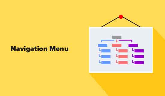
Many websites have either too many or too few links in the header navigation bar. Think about what you want people to do on your site, but also consider what visitors might want.
For instance, you might want your visitors to convert, but your visitors might want to know more about your company or learn about your philosophy.
If your navigation menu starts to look a little cluttered, consider organizing your site better. Use a main heading, then include a sub-menu with other links categorized below it.
A sidebar shouldn’t look like the rest of the content on the page. It should stand out.
Creativity is great, but not when it comes at the expense of user experience. Put navigation in places where people expect to find it.
Your website’s navigation menu isn’t for clever or witty tricks. Use the clearest design and text possible so visitors know what you mean.
This includes the header navigation bar, sidebar, and footer. Make use of those areas so visitors can find what they need. If you want to add creative navigation, such as by using multimedia, make it obvious that visitors can click.
8. Make sure that the website navigation is 100 percent responsive on mobile –

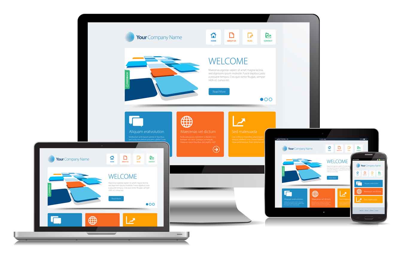
If your website navigation doesn’t render properly on mobile, you’re in trouble. There are responsive designs and themes for every major content management system, so make sure you avail yourself of them.
In some cases, the navigation menu is simply tightened. In others, the aforementioned hamburger menu appears. Make sure the links themselves are large enough for human hands to tap them easily. Remember that some people have larger thumbs than others.
9. Let your visitors scroll on your homepage –

Don’t be wary of designing a slightly longer homepage. Including 3-5 sections that help direct new and recurring users to proper areas of your site can help create a seamless experience.
But what should these sections be?
This list could go on forever, but a quick hit-list of some of the more crucial elements includes:
♦ Value proposition
♦ Intro Video
♦ Overview of Services
♦ Product Features
♦ About Us
♦ Testimonials
♦ Case Studies/Success Stories
♦ Resources
10. Don’t be afraid of white space –

Whitespace is an essential design element that helps you break up the page and increase readability.
Also called ‘negative space’, white space refers to the areas around elements on a page that are empty and lacking content or visual items.
Although extra space may seem superfluous, it’s actually responsible for readability and content prioritization. It also plays an important role in the design process and positioning website design elements.
If you know of some pages lacking white space, review the page and strip elements or content that aren’t necessary to the purpose of the page. Then, make sure this content is properly grouped so users are able to distinguish where they belong on the page.
11. Get found –

You actually have a lot of tools at your disposal to earn your website a great spot on Google’s search engine result pages (SERPs)
You might think that Google is omniscient, but even the most powerful rulers need a little help sometimes. While your website will inevitably be found at some point by the Google bots constantly crawling the web’s content, you can take a few actions to speed up this process.
12. Never stop testing –

Evaluating conversion paths, how far users scroll, and where they are clicking, etc, are important qualities that can reveal if your pages are performing the way you intended.
If you’re someone that has tons of pages to go through, chances are you may find this issue on a lot of pages, especially older landing pages.
Pages like these may actually be performing quite well, but contain outdated information that you know could be updated.
Others may just need some tweaking updates or design changes.Simple changes such as button colors, headers, or adding a few sentences in your copy could make incredible differences in the page’s performance.
Each test can reveal more a variety of data that identifies why users are interacting with pages in particular ways.
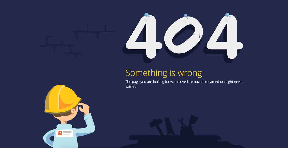
13. Identify unknown 404s or broken links –

The best way to detect these errors is by using Google Webmaster Tools. If you haven’t done so already, register your site there. It’s an essential tool to have for anyone running a website.
One of the most important tools provided in GWT is the Remove URL tool, which allows you to remove invalid pages from google site results.
14. Create new or unique offerings –

Through an online wallet, you can offer a number of services including electronic money transfers, payments, and transfers using digital currency.
: Be it New Year, Christmas or Valentine, people love to exchange gifts. You can give them a simple website platform to select, buy and deliver gifts (and flowers) online.
15. Update your content to appeal to your persona –

Using your high-performing topics as a starting point, brainstorm ways you might expand on what’s been published or approach it from a different angle. As you do so, refer back to your content audit chart to make sure that you’re not unintentionally repeating ideas that have already been covered.
To help guide your brainstorming process, consider the SEO value of each potential topic. Using HubSpot’s SEO tools, you can identify related keywords and build out topic clusters related to your primary keyword. By focusing your content creation efforts around these topic clusters, you’ll capitalize on the traffic generated by your star asset and ensure that visitors have enough content to keep them engaged once they arrive.


